PROTON
NOTES
A Note-taking app for the Proton Suite
ROLE: Sole Designer
Project Summary
Project Summary
OVERVIEW
BACKGROUND
In April of 2024, Proton announced that they had bought Standard Notes with future plans to bring its note-taking services to Proton users.
I created a concept for Proton Notes to examine what this would look like as an addition to Proton’s product suite.
BACKGROUND
In April of 2024, Proton announced that they had bought Standard Notes with future plans to bring its note-taking services to Proton users.
I created a concept for Proton Notes to examine what this would look like as an addition to Proton’s product suite.
Research and Discovery
Research and Discovery
DISCOVERY
COHESIVE BRANDING
Proton Notes’ aesthetic and layout needs to be cohesive with Proton’s other products like Drive, Calendar, and Mail.
COHESIVE BRANDING
Proton Notes’ aesthetic and layout needs to be cohesive with Proton’s other products like Drive, Calendar, and Mail.
GAP ANALYSIS
A gap analysis of word processors marketed towards authors reveal that authors seem to appreciate 4 key features: Organizational tools, Editing sections individually, .doc Format support and Offline access.
INFORMATION ARCHITECTURE
First I analyzed the Information architecture of both Standard Notes’ web and mobile apps. Then I made a common element layout diagram of Proton’s products to see which elements are unified across the suite. To reconcile Standard Notes’ IA with Proton’s common layout and enhance usability some changes needed to be made.
GAP ANALYSIS
A gap analysis of word processors marketed towards authors reveal that authors seem to appreciate 4 key features: Organizational tools, Editing sections individually, .doc Format support and Offline access.


Standard Notes Desktop

Proton Product Suite

Standard Notes Information Architecture (left)
and Common Layout Elements in Proton Desktop Apps (right)
Changes
Changes
CHANGES
1. NOTEBOOKS
Standard Notes uses a clever tag & folder system but it’s confusing to the average user. Notes go in notebooks, so Proton Notes will abandon the tag/folder system in favor of a notebook and tag system similar to Evernote.
2. SIDE-BY-SIDE EDITING
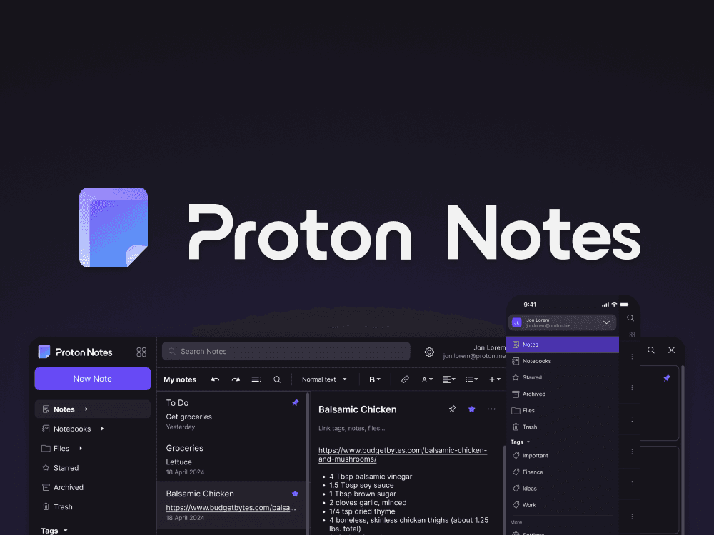
If we keep Notes in the sidebar (with Calendar, Contacts, etc.) even while the user has Notes open in the main window then they can effectively get a side-by-side view of different notes rather than jumping between notes as in a conventional note-taking app. This is useful for notes that have related information like a recipe and grocery list.
1. NOTEBOOKS
Standard Notes uses a clever tag & folder system but it’s confusing to the average user. Notes go in notebooks, so Proton Notes will abandon the tag/folder system in favor of a notebook and tag system similar to Evernote.
2. SIDE-BY-SIDE EDITING
If we keep Notes in the sidebar (with Calendar, Contacts, etc.) even while the user has Notes open in the main window then they can effectively get a side-by-side view of different notes rather than jumping between notes as in a conventional note-taking app. This is useful for notes that have related information like a recipe and grocery list.
3. GET RID OF NOTE TYPES
Standard Notes has Super Notes, Spreadsheets, Authenticator, and Plain Text note types. This is unnecessary and confusing. Spreadsheets and Authenticator can be moved into different products and Plain Text is superseded by the functionality Super Notes so it is the only note type that should be carried over into Proton Notes.
4. UNIVERSAL SEARCH BAR
Standard Notes separates searching for tags and notes (within the selected view) into different search bars. But users are becoming accustomed to a single search bar for everything. We use one search bar to enter website urls, search the internet, and, recently, even ask AI questions. Moving all search functionality into one text field is not only affordant but also unifies the layout with the rest of Proton’s products.
5. NEW LOGO
Create a new logo for Proton Notes. Proton needs a new logo for its latest addition to the suite. It borrows the design rules from the other logos to form a simple, note icon.

Proton Notes Desktop Concept
Mobile
Mobile
MOBILE SCREENS

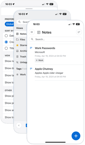
Standard Notes Mobile App
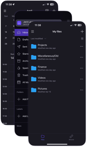
Proton Mobile Product Suite
Standard Notes Mobile App
Proton Mobile Product Suite
Standard Notes Information Architecture
Common Layout Elements in Proton Mobile Apps

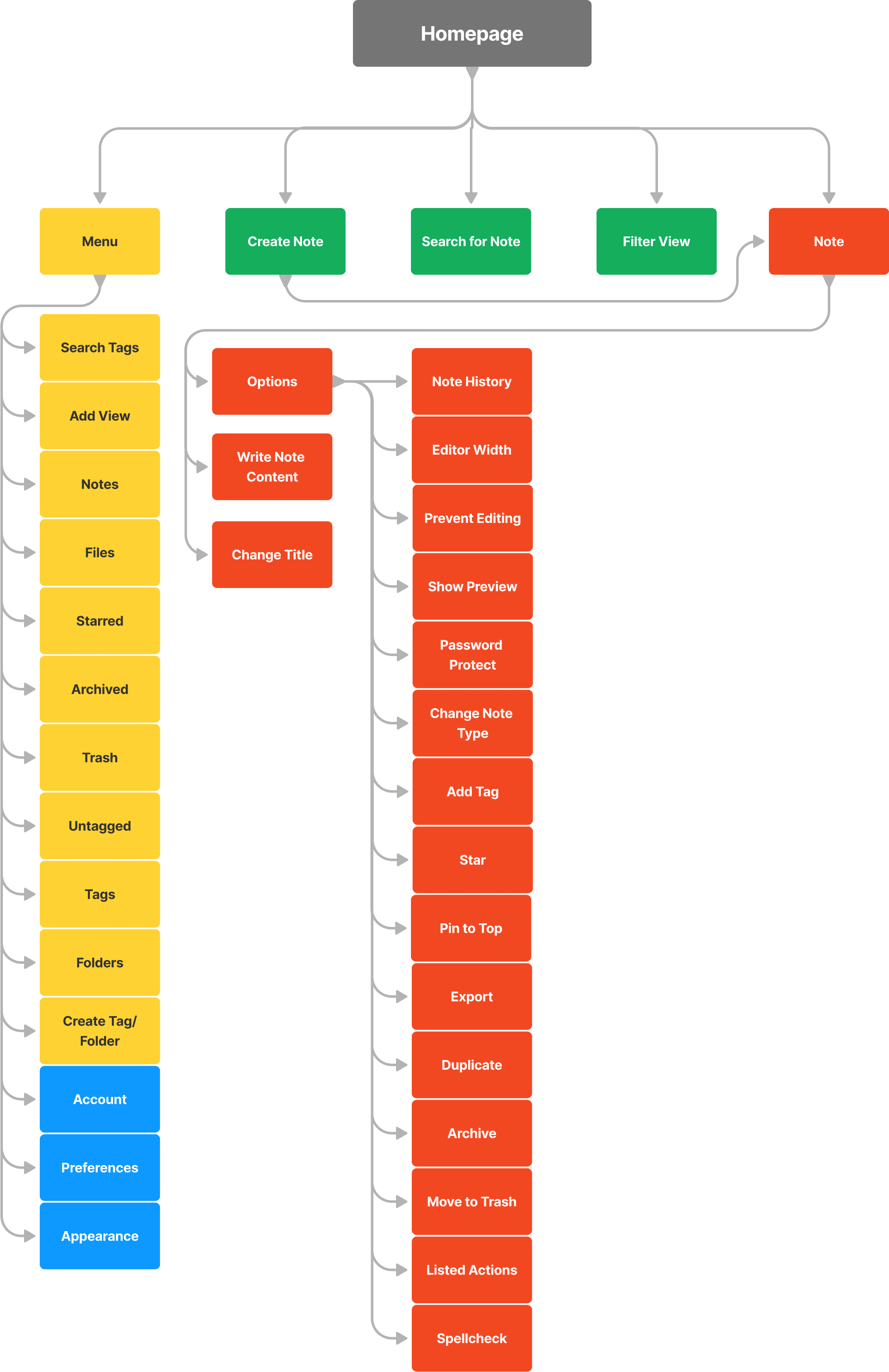
Proton Notes Mobile Information Architecture

MOBILE IA
COHEISVE LAYOUT
This layout is cohesive with the rest of Proton’s mobile apps. Although I did make one significant change that should be propagated to the other apps as well. Instead of the menu screen pushing in from the left, it moves in as an overlay. This makes the distinction between the menu and the main window clearer in dark mode. I also added a gradient at the bottom of the menu to indicate the presence of additional options outside of view.


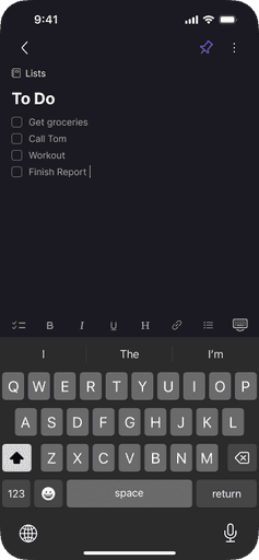
Proton Notes Mobile Screens


CONTACT


© 2024